
Michael Feathers recently wrote Measuring the Closure of Code, in which he described a way to use your version control history to measure how well your software conforms to the Open-Close Principle.
Summed up by its originator Bertrand Meyer, the Open-Close Principle says that code entities should be open for extension but closed for modification.
In practice, it means code that follows this principle shouldn’t need to be touched very often. If a change or added feature is needed, new code is written elsewhere.
For example, if you have code for a Car, and you later want to have a Solar-powered Car, you’d write new code related to the solar-powered-ness of the Car, but the old Car code shouldn’t need to change to accept a new power source. Interfaces are one way to make this possible. A Car can take an IEngine, and so long as the Solar-Powered Engine implements that interface, the Car code doesn’t need to change to accomodate it.
By and large, code that follows the Open-Close Principle is more modular, more cohesive, and less likely to change.
Feathers created a graph of a random open source project’s files and their relative number of changes. His analysis indicated that the high number of changes to a few files can indicate that there is some refactoring work to do.
So I decided to create my own chart for my current project Stop That Hero!. I used something similar to the following command in git:
git log --stat | grep "|" | awk '{print $1}' | sort | uniq -c| sort -n | awk '{print $1}'
and put the result in a spreadsheet in Google Docs. Out came this chart:
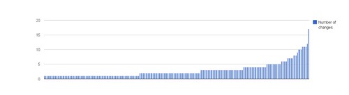
At first blush, I’m pleased that the number of changes per file is pretty low. The huge spike on the right is my main.cpp file, and because I’m not loading data from config files, most configuration data is currently being recompiled in there. It looks like my code does fairly well in terms of the Open-Close Principle.
To be fair, my project isn’t very mature. According to sloccount, my entire project is 9,650 lines of C++ code. There are 5,420 lines of production code and 4,163 lines of test code. Some of the code was written before this project, so any churn in git would have happened in a previous project. It’s possible that things will look worse as the project continues.
Still, it looks like a lot of my code is written once and leveraged well; however, the code represented by the far right of the graph is definitely sensitive to change. Those files represent some large classes that experienced some redesign or tweaks almost every week.
I love it when I can get a good sense of some aspect of my project by compiling metrics! And that’s not all. As Feathers concludes:
Another thing that is nice about this view of code is that you can get a sense of what your payback will be for your refactoring. The area under the curve is the total number of commits for the project. If we inch backward from the right, we can calculate something like the 5% mark – the files which you are likely to touch in one out of every twenty modifications. This may not seem like much, but it is over the duration of a project, especially when you factor in the effort of continually trying to understand that code. I have no doubt that there is a decent formula that we can use to calculate the likely savings from refactoring based on the ratio of adds to modifications, and the commits in a code base.
Now, it’s easy for me to look at the chart, nod, and then go on with my day, but I like the idea that I can get some measurable payback for “closing” down more of the code represented by the right side of the chart.
I’d be curious to see how a really well-written piece of software measures up. Is the curve flatter? Are there very few steep climbs? Do changes clump in certain pieces of app-driving code which simply leverage all the other code in different configurations?
How does your code’s closure measurement look?